Bootstrap Grid
In Bootstrap all content is organized in rows and columns.
Columns fit inside of rows. Rows fit inside containers. Columns are defined by the number of "spans" they take up, with a total of 12 spans.

Bootstrap lets you organize content based on the “number of columns” a div spans – out of a total 12 columns.
EXAMPLE:
<div class="col-md-12">
(Spans full width)

<div class="col-md-4">
(Spans 1/3 of full width: 4 + 4 + 4 = 12)
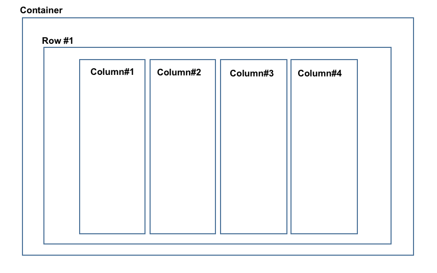
Every Bootstrap Grid is made up of:
- containers
- Which wrap the entire grid
- rows
- Which are defined first and are just rows
- columns
- Which are defined within rows and specify the columns. The sum total of all columns within a row must add up to 12.
For more info check out: https://www.w3schools.com/bootstrap/bootstrap_grid_basic.asp
Setting up the Code:
- Rows always go inside of the larger container. And columns ALWAYS go inside the rows.
- The "formula" for column classes is
col-*size*-*span*, andspanis any integer between 1 and 12. All columnspansin a row add up to 12. - The
sizerefers to the device or screen width.
<!-- Creates the Overall Grid -->
<div class="container">

  <!-- First Row -->
  <div class="row">

    <!-- First (and only column) -->
    <div class="col-md-12">
      <h1>I'm in Column 1 of 1. I stretch the entire width. And keep going.</h1>
    </div>
  </div>

  <!-- Second Row -->
  <div class="row">

    <!-- First of two columns -->
    <div class="col-md-6">
      <h1>I'm in Column 1 of 2</h1>
    </div>

    <!-- Second of two columns -->
    <div class="col-md-6">
      <h1>I'm in Column 2 of 2</h1>
    </div>

  </div>

</div>
What this code looks like in the browser:
